Thursday, May 28, 2009

Spreading Lies

I discussed the treasury yield curve steepness (10-year minus 2-year) in a recent post titled How Steep Is My Valley. Today, some additional detail.
_______________________________________________________

Long-term interest rates are jumping, with yields on 10-year treasuries now up to 3.73%. Apart from the significant impact on the real economy (e.g. higher mortgage rates ), this development is also placing into doubt the validity of a long-standing leading indicator, i.e. the yield spread between 10-year and 2-year treasury bonds (see chart below, click to enlarge).

Data: FRB St. Louis

Economists and market analysts commonly use this spread as a predictor of future economic activity and, thus, the direction of corporate profits; and from there, the prospects for the stock market. Indeed, it is one of the components of the official Leading Economic Index calculated by the Conference Board.

Right now the spread stands at 273 basis points (2.73%), the widest ever. Many analysts, therefore, are predicting the economy will turn around in short order and start growing smartly once more (the V- Gang). Ditto for corporate profits and, predictably enough, for share prices. which have been discounting exactly such a possibility for the last three months. To judge from the shop-talk in the various dealing rooms I contact on a regular basis, the 10-2 spread is the single most fashionable indicator right now.

I think this to be a grave mistake. I believe that, unlike other instances, the spread is widening because of two developments unprecedented in the history of the US (though common enough in other, less developed countries, in the past).
  1. On the short end, the Fed is engaged in massive monetary operations (quantitative easing) and is keeping short rates near zero.
  2. On the long end, the Treasury is bailing out financial and other corporations by promising to inject trillions of dollars it does not have and has to borrow. This massive supply of new Treasury bonds - present and upcoming - is putting upward pressure on long rates and placing the country's AAA credit rating in serious jeopardy.
Clearly, therefore, the widening of the spread is not due to fundamental economic strength. Instead, it is indicative of the rising risk premium that investors are demanding for lending the US government money for longer period of time.

For a better appreciation of this fact, look at he chart below: it's the 10-2 spread divided by the yield of the 2-year treasury, i.e. the spread as a percentage of the 2-year yield (today, 273 bp/97 bp = 2.81= 281 bp).

The premium demanded for lending long is at a very significant new record high, when measured relative to short-term rates. In my opinion, then, to interpret the 10-2 spread as a harbinger of an imminent V-shaped recovery is tantamount to "spreading lies"..

...and P.S.

Durable goods orders were announced today, up "more than expected" at +1.9% for the month. Here's the crucial detail: defence goods were up a whopping +23.2%. Without them the increase would have been +0.6%. Now.. do you suspect that some DOD orders were placed ahh.. shall we say.. opportunely? Nah...

Wednesday, May 27, 2009

Oxymoronic Announcements

Today's post is inspired from yesterday's Conference Board press release, announcing that the Consumer Confidence Index for April jumped to 54.9 from 40.8 in March. Here is a relevant passage: "Continued gains in the Present Situation Index indicate that current conditions have moderately improved, and growth in the second quarter is likely to be less negative than in the first" (italics added).

Now, what the heck kind of language is this? It certainly doesn't qualify as proper English, since "negative growth" is an outright oxymoron. What the establishment's perennial cheerleaders are attempting is to couch their statements in as anodyne a language as possible. It wouldn't be as obfuscatory and deceiving to simply say, for example: "The US economy is in decline but next quarter it may drop a bit less fast".

In any case, the context is entirely misleading. The Present Situation Index hardly budged: it increased from 25.5 to 28.9. The headline index moved sharply up almost entirely because the Expectations Index rose from 51.0 to 72.3. In other words, HOPE. (By the way, that's the broad category under which "green shoots" appear, as well.)

For a less massaged message, therefore, here are charts of the indeces - pictures being worth a thousand words, and all..
  • The headline confidence index jumped nicely in April..
  • .. but people assessed their present condition as quite awful (that's also known as the real economy)...
  • .. instead, all that happened was that their expectations (hopes) for the future jumped massively.

Well, good luck with that, because hope does not buy groceries or pay the mortgage. And it can't be used as collateral to increase borrowing, either.

Thursday, May 21, 2009

GDP On Debt Steroids

After bouncing from absurdly-low levels that discounted a new Great Depression, markets have now gone giddy and are blithely discounting a sharp, V-shaped recovery in the economy.

It's not going to happen. The reason can be easily deduced from the chart below (click to enlarge). It shows annual growth rates in nominal GDP and household debt. Notice the tight correlation that existed until 1998, when a substantial and prolonged divergence began and persisted for a whole decade.

GDP Was On Household Debt Steroids During 1998-2008

This was a direct result of the low interest rate policies instituted by the Fed in the aftermath of the dotcom bubble and the 9/11 attacks. The purpose, clearly articulated by then Chairman Greenspan, was to artificially "goose" the domestic real estate sector in the US.

The result, benign at first, was that the economy got hooked on debt steroids. GDP growth bounced back starting in 2002, but it took ever more debt to eke out further modest gains. The ultimate cost was bulging household debt, particularly in lowest-quality mortgages and consumer loans, which could not be supported by workers' earned incomes. Household debt as a percentage of disposable personal income jumped from 90% at the end of 1998 to 132% at the end of 2007 - the fastest rise ever.

Consumption makes up 70% of the US economy. Given that American households are in no great hurry to resume borrowing and that banks are, likewise, in no condition to resume lending to incremental borrowers, growth will be dependent on the other, non-consumption 30%. How fast can government spending and corporate investment grow, to outstrip the weakness of the household sector? Not that fast...

Surely, we can't bet on them growing so fast as to generate a sustainable V-recovery. After a period of inventory-to-sales adjustments that will last a few months (happening already, I believe), we will enter The Great Reset period. And this will go on for years, even decades.

The conclusion is that corporate profits in the financial and consumer sectors are going to be weak for a long time to come. Markets, too, are going to eventually figure this out...

Tuesday, May 19, 2009

The Oh, Very Funny Index (tm)

A bit over a year ago we were experiencing an "All Up" market, as risk was priced at sunshine forever levels and leverage soared; on average, hedge funds had two dollars of margin debt for every dollar in net assets. Then, the crisis hit and we had an "All Down" market where risk became poison; by March this year hedge funds were down to 14 cents of debt for each dollar of net assets. As we say in the business, everyone was "puking" risk and leverage.

And what about now?

Within less than three months we are back to "All Up", albeit from much lower levels. Everyone is out looking for a bargain and falling all over themselves so as not to miss out. Every financial market I am following is furiously discounting a V-shaped recovery. Stocks, junk bonds, dodgy sovereign debt, CDSs, commodities, yield curve spreads, volatility indexes, ship charter rates... everything is moving upwards in lockstep. Risk appetite has come back with a vengeance. Hedge funds were up to 28 cents of margin debt in April.

I am very amused...

So, I am constructing the Official Hellasious V-Recovery Financial Index (OH-VRFIN), also to be known as the Oh, Very Funny Index (tm).

Here's what I'm doing: from a starting date of Monday, March 2, 2009 I calculate percentage changes in the following:
  1. S&P 500 Financial Sector Index (SPF).
  2. Volatility Index (VIX, inverse).
  3. Crude Oil (WTI futures, spot month).
  4. Copper (Comex futures, spot month).
  5. Baltic Dry cargo ship charter index.
  6. iTraxx High Vol Index (inverse) - that's the CDS index for "junk" names outside the US.
  7. Yield spread between 10-year and 2-year Treasuries.
I add all percentages together, average them out (equal weight to all) and, voila, create an average that starts on March 2, 2009 with a value of 100.

As of last night the average gain of the seven components was +44.8% and thus the Oh Very Funny Index had a value of 144.8. The simple annualized rate of gain in these past 2 1/2 months is, therefore, a very sharp +215%. Now, that's what I call discounting a V-shaped recovery!

The chart below breaks out the individual components of the index (click to enlarge).


Monday, May 18, 2009

Low Wages + High Consumption = Massive Debt

Today, a continuation of the previous post's theme on the loss of earned income, its substitution with debt as an enabler of continued consumption, and what it all means for today's "Great Transition".
_______________________________________________

The reasons why the current "crisis" is not going to pass quickly and painlessly can be traced back several decades.
  • Real earned income per worker in the private sector, i.e. wages and salaries adjusted for inflation, collapsed after 1972. Average wages are still 16% lower than in 1972, when Nixon was two years away from resigning as President.
Real Average Weekly Earnings Per Person
Employed In The Private Sector (1982 dollars) Chart: BLS
  • Despite the massive drop in real compensation, which produced a brief flattening-out period in consumer spending between 1973-1982, Americans quickly resumed spending with gusto. Real personal consumption expenditures (PCE) per person working in the private sector kept rising ever higher.
Real Personal Consumption Expenditures Per Person
Employed In The Private Sector
(2000 dollars)

  • In the face of dropping real earnings, how was this ever-higher consumption possible?
In two ways:
  • First, the saving rate was drastically reduced all the way down to zero; it even went negative for a short while at the height of the real estate and credit bubble. People spent more and more of what they earned instead of saving some of it.
Personal Saving Rate Chart: FRB St. Louis
  • Second, American families went into massive debt. Household debt exploded upwards from 42% of GDP in 1972 to 98% today.
Household Debt as Percentage of GDP

  • Further, when we look at real household debt per person employed, the picture is even more troublesome. Real debt per working person tripled between 1970 and 2008, despite the fact that many previously non-working people entered the workforce - e.g. women.
Real Household Debt Per Person Employed (2000 dollars) Data: BLS, FRB

What does this mean for today's credit-challenged economy? It means that it cannot bounce back as fast as it did in previous recoveries (a.k.a. V-shaped), because debt can no longer act as the potent catalyst for consumption (70% of GDP).

Therefore, the signals now flashing from the financial markets are very likely too optimistic. The stock market, in particular, is discounting a future for private consumption and corporate earnings that would have been possible, even probable, twenty or even ten years ago but cannot happen now.

Friday, May 15, 2009

The Real Economy In Pictures

You know, we really don't need a ream of statistics and a cadre of expensive analysts to understand the real economy. Here are a few charts; they are enough.
  • First and foremost, Unemployment. Literally, off the charts.
Continued Claims for Unemployment Benefits
  • Secondly, Real Earned Income. Average real weekly wages for jobs in the private sector are 16% lower than in 1972. Nixon was President, there was a draft for the military and people drove muscle cars.
Average Real Weekly Wages (1982 dollars) Chart: BLS

1972 Ford Gran Torino
  • Third, Household Debt as a percentage of disposable income. It took 40 years to rise from 60% to 100%; and then a mere five years to soar to 135% (a.k.a. Sudden Debt).
Data: FRB Z1
  • Conclusion: Though it has just blown up in our hands, this crisis was a long time in the making and won't go away in a few quarters.
Restoring balance to the economy will take a lot more than bailing out the financial system. It will require a Great Reset of society, a rebalancing of our values and attitudes on consumerism, assets, incomes, resource utilization and climate change.

Wednesday, May 13, 2009

The Lazarus Market

"Reports of my death are greatly exaggerated". Thus quipped Mark Twain when he heard that The New York Times had, rather prematurely, printed his obituary.

The bubbly stockmarket of the previous two months (sharpest rise in 70+ years) provides a similar counterpoint: Reports of the imminent resurrection of the economy are greatly exaggerated. Besides the bleating heard from the Wall Street herd (what do lemmings sound like, anyway?), such cacophony is emanating from a multitude of other overeager prophets. From the Fed and ECB respectively, Bernanke is talking about green shoots (an apt analogy for grazing omnivores?) while Trichet says the eurozone is "bottoming out" (a bum pincher, is it?).

Apologies to the religious, but I don't believe in miracles - particularly when they are pre-announced (on March 3 Mr. Obama said stocks offered bargains for long-term investors), orchestrated (Fed and Treasury immediately picked up the tune) and carried out in concert with interested parties operating not-so-behind the scenes (e.g. stress test results were radically beautified before announcement).

Thus, I'll call this market Lazarus, just like Elwood P. Dowd (James Stewart) called his giant rabbit companion Harvey. This is a market that does not describe the economy as it is, but as it should be according to the rising number of false prophets of boom.

No matter how many times this market cries "Lazarus, come out!", the real economy is not going to revive until the fundamentals are there once more. And this won't happen with mere injections of money on bank balance sheets, no matter how many trillions are involved.

Once again, then: what is needed is help on the earned income side, not the asset side. Good jobs and good pay, not higher prices for stocks and real estate. Period.

Monday, May 11, 2009

The Great Reset Results In Traps

For several months now I have been thinking about what we should call today's economic environment. "The Crisis" is too generic and not descriptive enough; I reject "Great Depression II" for reasons I have previously explained (essentially, the Fed and Treasury injected trillions into the system and averted a banking meltdown). Conversely, "The Great Recession" is too mild a term for what is quite obviously something far greater and consequential than a few quarters of very low or negative GDP growth.

What then?

I have come up with "The Great Reset". By that I mean that the world as we know it, including finance of course, is not facing a simple reduction in economic activity due to a temporary inventory-demand imbalance, or a transient panic in financial markets. These are mere symptoms of a far more serious condition, or rather a series of conditions, that when taken together point to The End of Permagrowth. Too numerous to analyze here, they include resource depletion, climate change, overpopulation and, crucially for finance, too much debt vs. earned income.

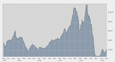
I came up with today's Reset idea because I am hearing that a couple of investment banks are putting together "opportunity" funds to purchase distressed shipping loans, and perhaps even dry bulk and container ships outright. Now, I'm the first one to lambaste brokers when they hawk "hot" stocks or sectors right at the top (e.g. during the dotcom craze) and should applaud this latest move, as it is happening after a precipitous drop (see charts of ship charter rates and vessel prices below).

Baltic Dry Index


On the face of it, now should be a great time to invest in shipping, kick back and wait for the cycle to turn. Aaah, but... what if this is, in fact, The Great Reset?

Consider just this: Americans are the world's biggest consumers. With just 5% of the population they go through 25-30% of it's resources, from crude oil to copper.. and autos, sneakers, t-shirts and La-Z-Boy recliners. They have lately started saving again, reversing a three decade decline in the personal saving rate (see chart below).

US Personal Saving Rate

An increase in saving means a decline in consumption and results in a much bigger backlash for shipping today than any other time in history, since so much US and EU manufacturing has been off-shored to China. A prolonged period of increased saving, therefore, will spell trouble for shipping for a long, long time.

Thus, the "opportunity" may be nothing of the sort - it may, in fact, be just another money trap.

Friday, May 8, 2009

Bailouts, Inventories and Jobs

The "green shoots" that everyone is talking about, and which are greatly responsible for causing the current (dead cat ?) bounce in stocks, are best explained thus:

1. The massive bailout of the financial system (approx. $14 trillion in equity injections, loans and guarantees) prevented its meltdown. However, financial stocks had priced in such a risk by moving much lower (the KBW US bank share index was down 85% at its low) and are now simply correcting this negative excess.
  • But, this is NOT the same as a rally based on better business prospects for the future. Thus, it has "short-term and limited" written all over it.
2. The sharpness of the consumer pull-back caused businesses to likewise sharply curtail new orders to work down inventory. Since the economy now operates on VERY tight inventory-to-sales ratios (JIT: Just In Time deliveries) this caused a whole series of dominoes to drop all the way back to BRIC+ manufacturers, commodity producers and transportation companies. As inventories dropped, however, some new orders are now - necessarily - reappearing, exactly because of JIT.
  • But, these are NOT orders based on projected robust growth; they are simply replacement orders, and they reflect reduced consumption going forward. Thus, the "real" economy has "anaemic" written all over it, at best.
3. Because of the above sharp pullback, employment got hit very badly, very fast. Continued claims for unemployment insurance shot up in a straight line and are at the highest level ever. Because of the inventory adjustment orders, however, going forward the rate of job losses will subside somewhat and this is causing unwarranted cheer.
  • But, fewer job losses should not be interpreted as a sign the economy has turned the corner, as it has in the past; the slower pace is expected, after such a huge decline.
Bottom line: do not be fooled by the "green shoots". They are merely happy talk from officials anxious to turn lemons (a slower pace of decline) into lemonade. Let me put it in mathematical terms: just because the second derivative is getting less negative doesn't mean the first derivative has stopped going down..
______________________________
Jobs Report Addendum

The BLS reported that 539,000 jobs were lost in April, "better than expected" because the consensus amongst analysts was for a figure around -600,000. Markets cheered.
Some observations, however:
  1. The previous months were adjusted down to show an additional loss of 66,000 jobs.
  2. The government added a near record 72,000 jobs because it is hiring upcoming census takers.
  3. The BLS Birth/Death model was at it again, adding 226,000 jobs (not seasonally adjusted). For what it's worth, this statistical model has added jobs to the reported figures in 12 out of the last 13 months; in a recession, no less...

Thursday, May 7, 2009

It's A Copycat - Deadcat Bounce

Spring has sprung violently in all risk markets, from junk bonds to sovereign credits, from financial to alternative energy stocks, from copper and crude oil to ship charter rates. In a word, from risk revulsion and panic selling to risk appetite and panic buying, all in the space of a few months. My, my.. what on Earth is going on?

VIX is back to July 2008 levels!

As best as I can gauge it, the "logic" of traders in dealing rooms across the globe is as follows:
  1. "They" are not going to let the system collapse.
  2. "They" want asset prices to move higher.
  3. "They" will do whatever it takes to make it so.
"They" being loosely identified with those mysterious, behind the scenes powers also known as TPTB believed (extremely erroneously, it must be stressed) to be all powerful, all the time.

The Greenspan put is now the Bernanke put and is deemed to have been exercised with a vengeance to the tune of several trillion dollars. Furthermore, such "put" operations have been expanded to include the enthusiastic support, or at least the tacit acquiescence, of every major politician and policy maker in the world.

Within two months the traders' motto has changed from: Sell everything before it's too late to: Buy everything before it's too late. In my 25 years of active involvement in markets I have never seen such a perfect and absolute reversal of psychology in such a short time. Economists can argue about the shape of the economic recovery until the cows come home, but for traders it's V all the way, baby..

There is no fundamental rhyme or reason necessary; after decades of deeply imbibing from the free-market neo-liberal chalice, adherents religiously believe the market creates its own reality. If stocks are up, then the economy must be getting better and thus.. buy before it's too late. Traders are looking over their shoulder to their mates next screen over and mumble determinedly: "I'll be damned if I'm left behind."

And that, ladies and gentlemen, is a copycat speculator, trader, ivestor, whatever..

Trouble is.. this is not the 1990s or even the early 2000s. The game has changed and there is nothing left to goose; technology, real estate, commodities - they have all been played out. All we have left now is a huge pile of debt rapidly going to stink. That's NOT an asset, folks..

Here's what I think: this copycat bounce is going to quickly turn into a deadcat bounce.

Tuesday, May 5, 2009

How Steep Is My Valley

The steepness of the US Treasury bond yield curve is once again reaching 30+ year record levels; the difference between 10- and 2-year yields is currently at 222 basis points, having previously nearly matched the record 270 bp of 2003 and 1992 (see chart below, click to enlarge).

Data: FRB St. Louis

Many analysts interpret this as a clear sign of imminent economic recovery, and so do stock market bulls. I was just speaking to an investment bank trader and he confirmed that they are using the 10y-2y spread as a market signal, both in the US and in Europe. So far, so good, it seems.

But... today's proper interpretation of yield curve spreads should be differentiated from previous years. With short-term interest rates hugging the absolute zero mark (3m T-bills are at 0.14% and 2-year notes at 0.94%), long-short spreads of 2-3% are nearly meaningless because they are mostly predicated by a basic concept of monetary theory, i.e. the term structure of interest rates.

What I mean is that in interpreting the yield curve's current shape and steepness we should also take into account the absolute level of interest rates. We are simply too close to the limit, the boundary condition imposed by the impossibility of negative nominal interest rates (we did very briefly experience negative rates for 1m T-bills at the height of the crisis). In other words, it's one thing to have a 10y-2y spread of 300 bp as a result of 7% minus 4%, but a wholly different matter when it comes from 4% minus 1%.

Furthermore, we should consider another factor: increased credit quality concerns for US Treasury bonds. A year ago the credit quality of the US was unquestioned. Today, credit default swaps (CDS) for 10-year treasuries are around 40 bp (went as high as 100 bp), meaning there is measurable and meaningful default risk. This results in yield premiums versus previous years, specifically for longer-term bonds.

CDS for 10-year US Treasury Bonds

A very obvious observation is that as credit quality deteriorates lenders may still be willing to lend short-term, but become more cautious on longer term loans. This causes the yield curve to steepen (higher 10y-2y spreads) perhaps for the exact opposite reason than bulls may suppose, i.e. a weaker economy and massive bailouts make longer-term treasuries less secure and thus long rates go up. This is not something that the US market has had to deal with in the past because its credit quality was always presumed to be AAA+.

Thus, the 10y-2y spread being at near record highs should be more closely examined, and perhaps differently interpreted, than before.

Monday, May 4, 2009

One Chart, Plus One Word

Nominal GDP growth (i.e. not adjusted for inflation) has turned negative y-o-y for the first time in 50 years . That's no good at all.
  • One chart:

DATA: FRB St. Louis

...and...

Saturday marked the annual meeting of Berkshire Hathaway, which has lately become a sort of tent-revival affair, an apotheosis of investment guru-dom. This one went way over the top as 35,000 people crammed into an arena, its overflow rooms and a ballroom at a nearby hotel to hear the presumed wisdom of Messrs. Buffett and Munger.
  • One word: hubris.

Friday, May 1, 2009

The Culprit, Revealed

Americans are in debt. Way too much debt. This much we definitely know by now, having learned it the hard way. What is less well known is.. why?

So, here is a VERY simple chart that should answer this question, once and for all.

Real Total Private Average Weekly Earnings ( 1982 Dollars, Chart: BLS)

Stuck with dropping real wages, but most definitely still dreaming The American Dream, we switched to borrowing it, instead of earning it.

The ratio of debt growth to GDP growth (i.e. the annual increase in total debt outstanding to the increase in nominal GDP) shot upwards. Our "growth" was, by necessity, debt-induced and debt-fueled because real earned income stagnated. After 2000 we were adding a massive 5-6 dollars of new debt for every 1 dollar of additional GDP we generated - see below.


Culprit found, case closed.
------------------------------------------------------
ABBY WARNING:
Goldman's Abby Joseph Cohen is at it again: she thinks S&P 500 will surge to 1,050. Don't say I didn't warn you..