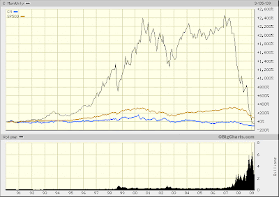
There is no better illustration of the Rise and Fall of The Era of Finance than the chart below (click to enlarge). It compares the market performance of Citigroup stock with GM and the S&P 500 index. Citi is black, GM blue and S&P 500 yellow.
No further comment necessary.
No further comment necessary.

On a similar note, Greenie pointed this interesting tidbit out.
ReplyDeleteBest performer of all since 1980.
If I only knew then what I know now
"Best performer of all since 1980."
ReplyDeleteYou left out the most crucial part, however: RISK ADJUSTED. Otherwise, it is probably near the bottom.
Ah, details..
"Market Cap- to-GDP Back At 1990 Levels"
ReplyDeleteI know you are feeling a bit boolish, but Greenie says there may be lot more room to go :)
Why the stock markets will eventually be shut down
Actually, your long term chart supports my point. If the market went 100% above its mean to reach the peak, it will be 100% below the mean at the bottom.