The recent sudden collapse of UK Gilts (government bonds) led me to write a post warning about black swans on the horizon. In it I mentioned US public debt, ie Treasury bonds.
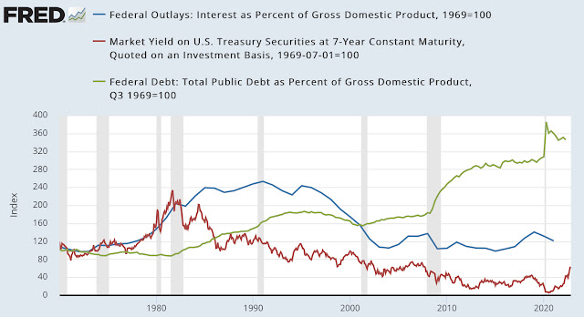
Today, a chart that should have all of us worried. It shows the relationship between federal debt as a percentage of GDP (green line), the market yield on 7-year Treasury bonds, chosen because the average maturity of federal debt is approximately 6 years (red line), and interest paid by the federal government as a percentage of GDP (blue line). All data are shown indexed to better observe the trends (1970=100).
While debt/GDP has constantly gone up and recently soared, debt service/GDP has been low because inflation was low, thus keeping interest rates very low. That’s obviously no longer the case, meaning that the US government will have to devote a much bigger portion of its budget towards paying interest.

No comments:
Post a Comment